Comments:
Jacque: Really cool critter selection!
This looks like it will be really fun to model and paint!
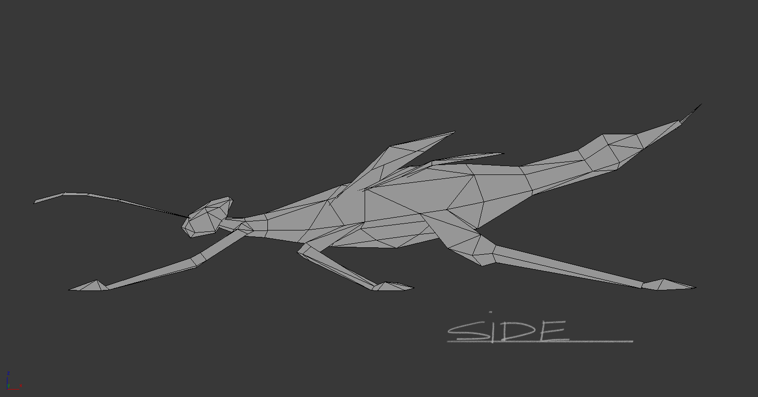
Wireframe Orthographic
Comments:
Sarankan- 15/05/12 - Hey This is roughly how its looking so far has about 496 tris, still in wip..I
honestly struggled quite a bit in trying to get the volume for the different legs, I tried to be a bit more even with the mesh distribution but been generous on the head.
Tutors feel free to rip it apart!! Thanks
Del - Looks promising Saran, but at the moment everything is too ‘literal’. His antennae, and legs
are so thin and spindly it would be hard to read them from a decent distance. You should always remember to add your artistic judgment to your models to help ‘sell’ things. Just because the legs are super thin in real life, doesn’t mean that your model won’t benefit from making them a little thicker.
Also the bug is super flat from the front view (which is just like the photo ref i understand), but you want to be able to ADD to real life things by exaggerating slightly where necessary. So possibly think about tilting the wings forward ever so slightly so it gives a more interesting silhouette. Keep going, great start.
Saran - I tried to optimise a bit more and collapsed a few of the loops at the bottom and a few
other areas but was able to retain the overall silhouette, however the tail end is looking slightly dense, but even there it should have less triangles compared to my previous attempt.
Sarankan - 15/05/12
From Del’s crit it was evident that the bug critter was too flat almost looked like it was all on the same plane. The main changes I tried to incorporate were
- The legs were too thin, so i tried to beef it up slightly, although it still looks slightly thin..
- It was very evident from the front that it looked too flat and none of the other interesting areas of the critter was contributing to the silhouette so I tried to enlarge the wings slightly and tilt them forwards. The main body was also looking almost 2 dimensional so I tried to add volume overall to the torso and made the lower side of the torso a bit more rounded.
- The side view suffered similar issues to the front view so I tried to incorporate some weight by slightly tilting the the torso.
- The front limbs looked kinda straight on the first model so this time I sort of tried to counter pose it to the middle set of limbs. I also added some volume across all the joints to give a slightly better shape.
- The feet of the critter was also not easily recognizable so I hope its slightly more obvious now.
I hope its a little better now ( sorry for the excessive screenshots )
Tutors feel free to rip it apart!! Thanks
Jacque: Great work so far!
Something to possibly consider for the antenna is to make them ‘Alpha Planes’, so you can get a bit more of an interesting shape. Also this might free up (and allow you to use those extra triangles) to maybe add a couple more edges in there, to round out the shape of them a bit more.
Another thing to make your mesh more ‘clean’ is to try making it a little more ‘airtight’.
Try not to float the limbs, or wings on the geometry, but actually give it the proper loops (geometry always tends to look better when you do that). Another thing is, that the limb seems to get ‘larger’ where it connects to the body (shoulder joint).
If you wanted to optimize a bit, you could probably stand to use a little less detail on the head, and optimize some of the polygons underneath.
Sarankan: Thanks for the advice, ye i'll get on it
I’ll definitely try and combine the legs in with the torso but as for the wings I’m going to intersect them and try and align it to the topology underneath as suggested by Steffen.
Ill post up all the stuff once Ive made the necessary changes.
Sarankan - 16/05/12
 I’ve made the necessary fixes (hopefully); I have welded all the limbs, the only thing floating are the wings and antennas..I have reduced the tris in head quite a bit and other areas too and atm the tris count is 478. I hope its looking a bit better, if there are any major concerns let me know cause i'd like to start the unwrapping and texturing process
If all the topology looks ok i was thinking of exaggerating areas a bit more
Tutors feel free to tear it apart! Thanks!
 Jacque - Use all 500 polygons! Throw them in areas to round out silhouette, like wings, or the body. Looks great! UVs are fantastic! Start painting ASAP!

 This was the first texture pass but after seeing some of the crits of others it was clear that this texture was quite monochromatic and needed a bit more colour variation so added some warm hues
I hope i haven’t gone too dark with the shadows ( but i get a feeling that i have:/)

The psd setup is nothing technical..I just have a main diffuse and have one layer on top which I paint on and I basically makes changes on that,then save it and check it in max and If it looks ok I just collapse it and put another layer. The Ao is on top with with multiply with the opacity usually turned down.
Update: I am terribly sorry I completely forgot about the psd setup:( i’ll definitely do that for next time. next time
Comments:
Hai: This is looking really nice. I don’t think you have to worry quite as much about hue variation given that this bug is naturally rather monochromatic. If you make up too much stuff on it it may begin to appear as a different species. With that in mind, I think I actually prefer your initial block out for the texture more, but that’s just me. Any real variation you do would have to be pretty subtle. I do think you could try suggesting those red spiney bits in the diffuse.
Sarankan: Hey Hai thanks for the input!, ye I think I think I might try and get add some of that spiney bits and ye I was slightly concerned over the colour variation, im going to try and find a balance between the first and second one.
Sarankan: I added the spiney stuff and also lightened the darker areas a tad bit.Del: Saran its looking really nice. Just for the record it seems as though your shadows are making the forms kind of muddy. It looks as though your AO is uncoloured at the moment. Try going to your AO layer and go to Image > Adjustments > Hue/Saturation and hit Colorize. From there play with the Hue slider til you get a cooler hue. It will help give your model small variation without drawing it too far away from the reference.
Good job though!
Sarankan: I just tried this method u said on the AO and its pretty awesome, Im definitely going to take advantage of this method from now on and I did sort of set it to multiply and layered it on top of the diffuse with lowered opacity. It just didn’t occur to me to change the colour of the AO. Thanks for the input Del!
Tamara : good job, I really like how it turned out.


 I’ve made the necessary fixes (hopefully); I have welded all the limbs, the only thing floating are the wings and antennas..I have reduced the tris in head quite a bit and other areas too and atm the tris count is 478. I hope its looking a bit better, if there are any major concerns let me know cause i'd like to start the unwrapping and texturing process
 Jacque - Use all 500 polygons! Throw them in areas to round out silhouette, like wings, or the body. Looks great! UVs are fantastic! Start painting ASAP!